I was an Art Director on the DreamWorks production of Eldorado for about 10 minutes. Here's the one painting I did that's worth a damn. It's based on a drawing by the production designer, Christian Schellewald, who's one of the best designers I've ever met. Check out his book:
LA/SF: A Sketchbook from California published by
Design Studio Press.
Acrylic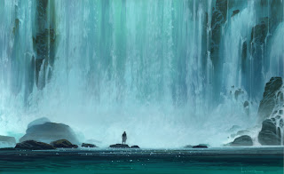

10 comments:
Simply awesome!
Hi Paul, I'm looking through all your pictures in pure amazement! Awesome work!
BEAUTIFUL. What is the technique of creating the organic/soft yet with edges here or there, of water? I know that sounds like a silly question but it's something I really enjoy about your work. I know you created some amazing color keys for LOTR01 with snow and watery feel.
MAC
...Can I have this? *big spaniel eyes* WATERFALL. I miss going to the waterfall some distance from my hometown...I fell off once but fortunately one of the guys I was with caught me before I went all the way down.
It's...it's...it's...I look at this painting and I immediately calm down and feel awed and happy all over again.
--Shuku
Thanks for the comments/compliments everyone:)
Mark,
Exactly which section were you referring to? The falling water, or the pool? I have different techniques for each.
Hey Paul,
Both if you are in for it. But I was definatly refering to the falling water. How did you go about the layering and how the heck did you capture the softness of the water floating down?
MAC
It really is a very very beautiful and magical image. Incredible.
Mark,
Well thank you:) Let's see if I can remember how I did the falling water. It was alomst 10 years ago, but I'll give it a go...
First off, it's a traditional painting...not digital, so no cool filters or fancy brush dynamics. Just real paint (acrylic and cell vinyl) on cold press illustration board...heavy weight.
Basically, I painted it in four steps...working from background to foreground:
1. The under painting was just soft, large, undulating shapes. These are visible as the mid-value parts of the water between the splashes. I painted this with transparent paint...like a water color painting...wetting the painting surface first with water (I use a sprayer), then applying wet color into the already wet surface. Before this dries, I use a large, soft, dry brush to blend the paint to create the soft gradations. (I suppose I could use an airbrush to do this, but you just don't get the texture, streaks, and accidents that you get doing it with real brushes. Believe it or not, I often use a house painter's brush as a blender. The best brand is "Purdy". The size depends upon the painting. I would have used a 2 inch on this one.) This went on in a few layers... allowing each layer to dry before applying the next (blow dryer)...building up the darks as I went.
2.Next I painted the splashes and most of the vertical streaks. This went on in two or three layers, building up to my highlights. To get the texture of the splashes I used a one inch basting brush. Yes that's correct, a basting brush. I think I paid 30 cents for it at the super market. Sometimes good artist brushes make marks that are just too clean. If you want texture, ofter you need to find a different tool. I use a lot of different types and shapes of brushes when I paint. Many traditionalists would be aghast:) A wise old sage once said, "Let the tool do the work."
3. Next I painted in the rocks as single-value dark shapes. A second, lighter value was all I needed to render the details into them.
4. Lastly, I painted the thin vertical drips spilling over the rocks with a high quality, small brush (probably a #5 sabel round. See, I do use expensive brushes...when they're necessary). These I painted with fast downward strokes, allowing the brush to glance across the surface, giving a "dry brush" effect which looks a lot like tiny drips. I used a mahl stick to rule against to keep my strokes straight.
The pool water, I painted in much the same way. I started with the big gradation as an under painting, then painted the ripples on top as horizintal scribbles. A few well placed long strokes in the distance, and lastly, a bunch of dots as highlights.
Whenever I look at my traditional paintings, I wonder if they would have looked the same if I painted them digitally.
I hope this helps.
Awesome Paul. Much appreciated. I'm going to do some experimentation for myself with this in mind. I really appreciate your time and explanation . . .love your work,
MAC
wow this one's great! nice composition.
man,,,, i don´t know what to say,,, but thanks for sharing this pieces,,,,, dam really.........cool jejeje,, i love the visual feeling that you stablish in that pieces._______cheers
Post a Comment