All artwork and text is copyrighted by Paul Lasaine, unless otherwise attributed to the respective copyright owner. It is illegal to publish, print or reproduce any such artwork or text without written permission by the artist or copyright owners.


Welcome to my my Portfolio Page.

This is where you'll find my professional work (and some personal pieces as well).

As always, I'm unable to post my current work, as it's for films that have yet to hit the big screen.

Don't forget to visit my BLOG. There's more of my work there, plus a bunch of other fun stuff.

Saturday, February 21, 2009

Venice

My family and I spent a few weeks in Italy last summer. There's so much art there - it's impossible not to be inspired. Of course I shot tons of pictures! Here's a painting based on one of them.

Once again, I painted this using Corel Painter. Though I do most of my work in Photoshop, for getting the look of oil paint, Painter still can't be beat.


Here's my lay in...after about an hour of work. One of the nice things about digital painting, is you can keep the early versions of paintings. Often, the under painting is just as interesting as the final product.

Sunday, January 11, 2009

Saturday Morning Sketch

Here's a quick sketch I did in Painter yesterday morning while I was waiting for my family to wake up. Painter's insanely overcomplicated, but there's a few things about it that I love - like their "Oil" brushes. Not the new ones from version 10, which are clunky...but the original ones. My favorites are the brushes called "Smeary Round" and "Smeary Flat". What's cool about them is that they can apply color and smear color in the same stroke. No changing tools. Something Photoshop can't do...at least not yet (hint, hint Adobe...).


Friday, December 19, 2008

The Prince of Egypt: 10 Year Anniversary

Today was the tenth anniversary of the release of The Prince of Egypt. In honor of that, here are a few more of my POE paintings.


Layout: Darek Gogol.


Layout: Darek Gogol.


Layout: Darek Gogol.

Wednesday, February 20, 2008

Drawings!

Yes, I do draw from time to time. Here are a few rare Paul Lasaine layout drawings done for a film at Dreamworks that'll probably never grace the silver screen. I'm not sure if I'm allowed to show them, but hey...it's been more than 5 years for crying out loud. There's gotta be some kind of statute of limitations for this kind of thing.

They're mostly black Sharpie on white paper. I used several pens in various stages of life. Some were very dry. I drew the facade in the first and last drawings separately, then composited it into the final drawings in Photoshop.


Sunday, February 3, 2008

The Phantom 2040

In the early '90s, I did a few concept illustrations for an animated series called "The Phantom 2040". The show got great reviews, but didn't last long...33 episodes...none of which I ever saw. Consequently, I have no idea if any of my designs were even used. But I was pretty happy with a few of the paintings, so here they are.

Sorry for the obvious Syd Mead / Blade Runner rip off; it's what they wanted. I had just finished work on Dick Tracy, and the producers specifically wanted their city to look like a cross between Dick Tracy and Blade Runner. Syd Mead was way too expensive, so I got the job.
(They're all painted in acrylic.)

The City


City : Detail


Arch Nemesis' Office


Police Chief's Office

Saturday, January 26, 2008

Half Dome

Here's an oldie. I have to say, I miss real paint...


Acrylic

And for those of you who like to see the brush strokes...

Saturday, January 12, 2008

Lily Pond Floor Mat

OK, this is one of the stranger projects I've worked on. It's a hand painted floor mat. Yes, a floor mat. The idea came from my mother-in -law (also an artist) who did something similar in her kitchen. My wife wanted one too.

It's acrylic on very thick canvas...varnished heavily. Yes you can walk on it:)


Tuesday, December 4, 2007

Surf's Up - post #12

Cody

OK, you all must be sick of Surf's Up by now, so this will be my last Surf's Up post.

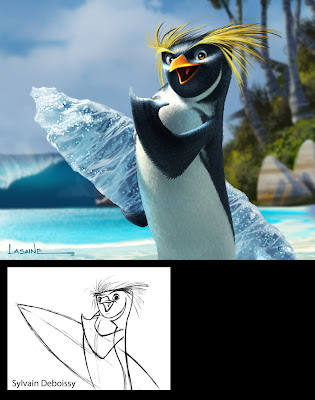
I'll end with my painting of the lead character, Cody Maverick. It's based on a drawing by our Character Designer, Sylvain Deboissy. The intent of the painting was to figure out what Cody (and all the penguin characters) would actually look like on screen.

Up until this point, we only had Sylvain's pencil drawings and marker comps, and there where a lot of questions about the penguins' finished textures. The biggest question mark was regarding feathers: should they have them or not? One concept that was gaining a lot of ground, was the idea that the penguins should look like their skin was made out of wetsuit material. Real penguins kind of look like they're wearing wetsuits anyway, and since our characters were supposed to be surfers...

The wet suit concept was intriguing, and the directors were definitely leaning in that direction. Partly because it was a fun idea, but also I think because they were afraid that a fully feathered character would look too busy on screen.

I, on the other hand, felt that when all was said and done, no matter how cool the wetsuit concept was, it would end up looking lame on screen...that anything other than a fully feathered character would just look boring...or at best, too cartoony...so I did this painting to sell the studio on what I thought Cody should look like.

In the end, this painting sold everyone on the feather idea...and the rest is history.
Thursday, November 29, 2007

Surf's Up - post #10

Baby Cody

This is my painting of Baby Cody based on Sylvain Deboissy's design. Baby Cody ended up being cut from the film, but his design was used for the character, Arnold...minus Cody's signature yellow plume feathers.


Surf's Up - post #9

Shiverpool Seaquence Color Keys


Surf's Up - post #8

Surfing Styles

I felt that each character should have their own personal surfing style, complete with their own distinctive board-wake...kind of like their signatures left in the water.

Monday, November 19, 2007

Surf's Up - post #7

Last post for a while. I'm going to Hawaii for Thanksgiving to visit my cousin who just moved there. She's been trying to convince me to start an animation studio on the Big Island. I must admit, it sounds attractive. Come on, who's with me?!?!

I'll leave you with this: my painting of Chicken Joe...based on a drawing by Character Designer, Sylvain Deboissy.


Surf's Up - post #6

Poster Concept and Video Game Cover

I worked on 35 posters in all for Surf's Up...including all the outdoor billboards, in-theater posters, and web-based ads. I wasn't a huge fan of the posters (they weren't my concepts or layouts, and I worked more as an illustrator on them), so I'm not going to show them here.

What I will show however, is my first concept for the poster. I knew marketing would never go for anything so graphic, but I had to get it out of my system. It still think it would have made a cool t-shirt.

The logo ended up became the official film logo...but with the colors reversed.


This is the cover of the Surf's Up video game, made by Ubisoft. This one is my concept and layout, and I would love to have seen it as the actual movie poster. Oh well.
(Oh, and I can't take credit for the basic rendering of the character; it's mostly CG.)

Surf's Up - post #5

The Waves

Certainly the most memorable images in this film are the waves. When we started, there was a question as to whether or not the kind of waves we knew we were going to need were even possible to create in CG. A highly realistic, start to finish, CG animated wave, that wasn't a cheat, had never been done before in film....at least not to the level we needed. It's was kind of a Holy Grail of CG. A whole slew of folks were behind getting them up on screen. From the work that Todd Pilger and his 3D Vis Dev team did early on, to the staggering work in the final film done by the Imageworks team lead by Rob Bredow, these waves went way beyond anything we hoped we could achieve.

Check out this article on AWN for more on creating the waves.

Our job in the Art Department was to determine what the wave should look like. We did dozens of paintings of waves in all kinds of lighting and weather conditions, and from every conceivable angle. Here are a bunch of them.


Layout: Marcelo Vignali


These last three are based on photos I found on line. Don't know who the original photographers were.


Surf's Up - post #4

Pen-gu Island Beaches

What's a surfing movie without beaches? We painted lots of beaches.
Design credit for the beaches goes to Art Director, Marcelo Vignali, and Chief Location Designer, Armand Serrano, without whom this film would not have existed. OK, it would have existed...it just wouldn't have looked as good.


Layout: Marcelo Vignali

This one was used for the billboard adds. There were characters in front of it.


Here are some color keys I did for the sequence where Cody arrives at the island. Again, compositions for these and all the color keys came from the Layout Department headed up by James Williams.